Your homepage is your digital shop window. It’s often the first page people see, and within seconds, they decide whether to stay or leave.
But here’s the thing… most homepages try to do too much. They shout about everything instead of clearly showing the one thing that matters most: why someone should care. A strong homepage isn’t about cramming in content; it’s about clarity, flow, and focus.
Start with a clear website purpose
Every homepage should answer three questions, fast:
- Who are you?
- What do you do?
- How can you help me?
If a visitor can’t answer those within a few seconds of landing, they’ll leave.
Your headline should be clear and confident, not clever for the sake of it. Your supporting copy should explain what you offer in plain language. And your call to action should tell people exactly what to do next — whether that’s getting in touch, booking a call, or viewing your services.
Show real results on your homepage
Visitors are naturally sceptical. They’ve seen plenty of “we’re the best” claims before. What they’re looking for is proof.
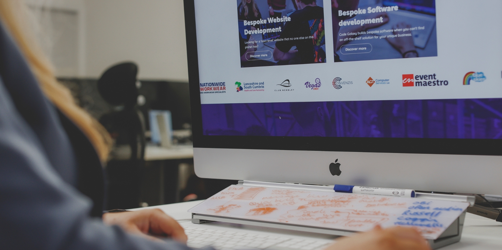
That proof comes from client testimonials, recognisable logos, accreditations, reviews, or short case studies. These signals build instant trust and reassure visitors that you can deliver what you promise. Show, don’t tell.
Guide visitors through your website journey
A homepage isn’t a brochure; it’s a signpost.
Its job is to guide visitors deeper into your website, to your services, portfolio, or contact page, without overwhelming them. Use clear sections with short, engaging summaries. Keep the design simple and easy to scan. People don’t read websites like books; they skim. Help them find what matters quickly.
Keep your homepage clean and uncluttered
What your homepage doesn’t need is just as important as what it does. Ditch the autoplay videos, pop-ups, long mission statements, or endless scrolling sections that dilute your message. White space isn’t wasted space; it gives your content room to breathe. A clean layout helps your message stand out and keeps visitors focused.
Build a website that feels effortless to use
Your homepage should look professional and align with your brand, but great design goes beyond visuals. It’s about how it feels to use. Fast loading, mobile-friendly layouts and intuitive navigation create a seamless experience that builds trust before a single word is read.
Create a website that works as hard as you do
Your homepage isn’t just about aesthetics; it’s about action. When it’s clear, focused, and designed around the user, it becomes one of your most powerful business tools. At Code Galaxy, we design and build websites that put clarity first… turning visitors into confident leads.
If your homepage looks great but doesn’t perform, get in touch and let’s make it work harder for your business.